Deal Flow Dashboard
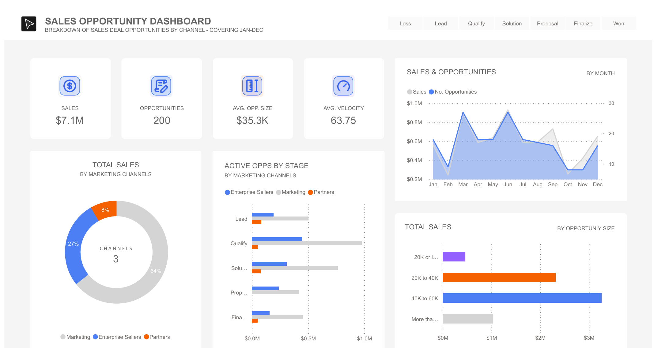
Here's a quick sales dashboard I put together in PowerBI to play around with some sample deal flow data. It's a neat way to visualize how deals move through different stages of a sales pipeline.

What's in the Dashboard
I included a few different views to make the data easy to digest:
-
The Numbers: You can see the basic stuff up top - total sales, number of deals in the pipeline, average deal size, and how fast deals are moving.
-
Sales Channels: Broke down where the deals are coming from - whether it's the enterprise team, marketing, or through partners.
-
Pipeline Stages: Shows how many deals are sitting in each stage, from initial leads all the way to closed deals.
-
Monthly View: Plotted sales and opportunities over time to see any patterns.
-
Deal Sizes: A simple breakdown of deals by size - helpful to see if we're mostly dealing with big fish or smaller opportunities.
Just for Fun
While this is using dummy data, it shows how you can take raw sales numbers and turn them into something visual and easy to understand. It's the kind of thing that could be really useful if hooked up to real data - helping track where deals are getting stuck or which channels are bringing in the most business.